
Stell dir vor, du öffnest eine Website, die nicht für Responsive Webdesign optimiert ist, auf deinem Smartphone und alles sieht winzig aus. Du zoomst rein, scrollst hin und her, versuchst verzweifelt, den Text zu entziffern, und klickst schließlich frustriert weg. Klingt bekannt? Dieses Szenario ist der Grund, warum responsives Webdesign heute keine Option mehr ist, sondern eine absolute Notwendigkeit.
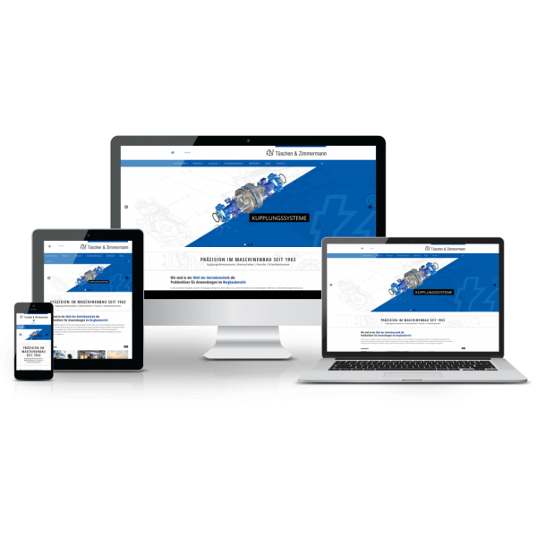
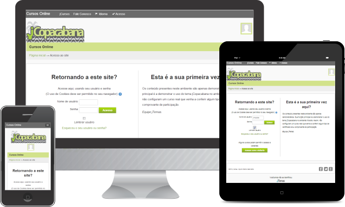
In einer Welt, in der Smartphones und Tablets nicht mehr aus unserem Alltag wegzudenken sind, ist die Anpassungsfähigkeit deiner Website an verschiedene Bildschirmgrößen entscheidend für den Erfolg deines Online-Auftritts. Responsive Webdesign sorgt dafür, dass deine Seite auf jedem Gerät perfekt aussieht und funktioniert, egal ob auf einem Desktop-PC, einem Tablet oder einem Smartphone. Aber was genau bedeutet „responsive“ und warum ist es so wichtig?
Eine responsiv gestaltete Website passt ihr Layout dynamisch an die Bildschirmgröße des Betrachters an. Das bedeutet, dass Bilder, Texte und andere Elemente sich automatisch so verschieben und skalieren, dass sie auf jedem Gerät gut lesbar und benutzerfreundlich sind. Das Ziel ist, den Besuchern eine optimale Nutzererfahrung zu bieten, unabhängig davon, wie sie auf deine Seite zugreifen.
Die Vorteile von Responsive Webdesign sind vielfältig. Zum einen verbessert es die Nutzererfahrung erheblich, was zu längeren Verweildauern und einer geringeren Absprungrate führt. Zum anderen bevorzugen Suchmaschinen wie Google responsive Seiten, was deine Chancen verbessert, in den Suchergebnissen ganz oben zu landen. Außerdem sparst du Zeit und Ressourcen, da du nur eine einzige Website pflegen musst, die sich an alle Geräte anpasst, statt separate Versionen für Desktop und Mobilgeräte zu erstellen.
Wenn du noch keine responsiv gestaltete Seite hast, ist jetzt der perfekte Zeitpunkt, um das zu ändern. Viele Agenturen für Responsive Webdesign bieten umfassende Dienstleistungen an, die von der Planung und Entwicklung bis hin zur Optimierung deiner Website reichen. Sie verstehen die Feinheiten des Designs und der Technologie, die erforderlich sind, um eine hochfunktionale, responsiv gestaltete Seite zu erstellen, die deine Besucher lieben werden.
Die Erstellung einer responsiven Website mag zunächst wie eine Herausforderung erscheinen, aber die langfristigen Vorteile für dein Online-Geschäft sind unbezahlbar. In einer digitalen Landschaft, die sich ständig weiterentwickelt, ist es wichtig, dass auch deine Website mit der Zeit geht. Responsives Webdesign ist der Schlüssel, um sicherzustellen, dass deine Seite für alle Nutzer zugänglich und ansprechend bleibt, unabhängig davon, wie sie auf sie zugreifen.
Denke daran, dass der erste Schritt zu einer erfolgreichen responsiven Website darin besteht, den richtigen Partner für die Umsetzung zu finden. Eine erfahrene Agentur für Responsive Webdesign kann den Unterschied ausmachen, indem sie eine Seite kreiert, die nicht nur gut aussieht, sondern auch hervorragend funktioniert. Mach dich bereit, deinen Online-Auftritt auf das nächste Level zu heben und eine Website zu schaffen, die wirklich jeder gerne nutzt.
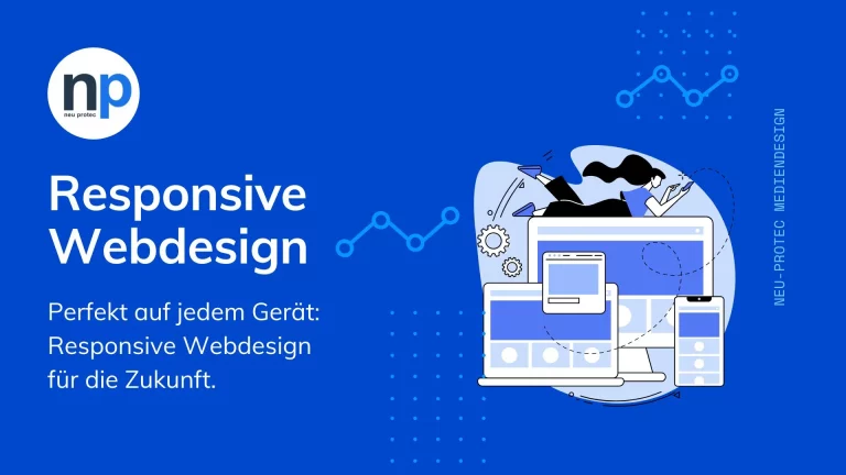
Grundlagen des Responsive Webdesigns: Wie du eine Website für alle Geräte optimierst
Responsive Webdesign ist kein bloßes Schlagwort in der Welt des Webdesigns – es ist eine grundlegende Technik, die sicherstellt, dass deine Website auf jedem Gerät, von Smartphones bis hin zu Desktop-Computern, optimal funktioniert. Aber wie fängst du an, und was sind die Schlüsselkomponenten, die eine Website wirklich responsiv machen? Hier erfährst du, wie du eine responsive Webseite erstellen kannst, die deine Besucher begeistert.
Das A und O einer responsiven Website ist das fließende Layout. Im Gegensatz zu festen Layouts, die eine bestimmte Größe haben, passen sich fließende Layouts der Bildschirmbreite des Besuchers an. Das bedeutet, dass deine Seite auf einem großen Desktop-Bildschirm genauso gut aussieht und funktioniert wie auf einem kleinen Smartphone-Bildschirm. CSS3 Media Queries spielen hier eine entscheidende Rolle, indem sie es ermöglichen, dass das Design deiner Seite auf die Eigenschaften des Geräts, wie zum Beispiel die Breite des Browsers, reagiert.
Ein weiterer wichtiger Aspekt sind flexible Bilder und Medien. Damit deine Bilder und Videos nicht verzerrt wirken oder unnötig viel Platz einnehmen, sollten sie so eingebettet werden, dass sie sich an die Größe des umgebenden Containers anpassen. Hierbei kann die CSS-Eigenschaft „max-width: 100%;“ ein Lebensretter sein, da sie sicherstellt, dass Medien nie breiter als ihr Container sind und sich somit nahtlos in das Layout einfügen.
Die Navigation ist ein weiterer kritischer Punkt. Auf einem Desktop mag ein horizontales Menü perfekt funktionieren, aber auf einem Smartphone könnte es zu überladen wirken. Eine Lösung hierfür könnte ein ausklappbares Menü sein, das als Hamburger-Icon dargestellt wird und auf kleineren Bildschirmen eine benutzerfreundliche Alternative bietet.
Falls du dich fragst, wie du diese Prinzipien in die Praxis umsetzen kannst, ist die Unterstützung durch eine Agentur für Responsive Webdesign eine Überlegung wert. Solche Agenturen haben das Know-how und die Erfahrung, um responsive Webseiten zu erstellen, die nicht nur technisch auf dem neuesten Stand sind, sondern auch optisch ansprechend.
Zusammengefasst ist das Erstellen einer responsiven Website kein Hexenwerk, aber es erfordert Aufmerksamkeit für Details und ein gutes Verständnis dafür, wie verschiedene Elemente auf verschiedenen Geräten interagieren. Mit den richtigen Tools und vielleicht der Unterstützung einer spezialisierten Agentur kannst du eine Website schaffen, die wirklich jeder gerne nutzt – unabhängig davon, auf welchem Gerät sie angezeigt wird.
Tipps zur Auswahl der richtigen Agentur für Responsive Webdesign

Die Entscheidung, eine responsive Website erstellen zu lassen, ist der erste Schritt in die richtige Richtung, um deinem Online-Auftritt zu mehr Erfolg zu verhelfen. Doch mit so vielen Anbietern auf dem Markt kann die Wahl der passenden Agentur für Responsive Webdesign überwältigend sein. Wie findest du also den richtigen Partner, der deine Vision versteht und umsetzen kann? Hier sind einige Tipps, die dir helfen, eine informierte Entscheidung zu treffen.
Verstehe deine Bedürfnisse und Ziele
Bevor du dich auf die Suche nach einer Agentur machst, solltest du dir klar darüber sein, was du mit deiner responsiven Website erreichen möchtest. Möchtest du deine Reichweite auf mobile Nutzer ausweiten? Oder ist es dein Ziel, die Nutzererfahrung auf allen Geräten zu verbessern? Ein klares Verständnis deiner Ziele hilft dir nicht nur, potenzielle Agenturen besser zu bewerten, sondern ermöglicht es diesen auch, dir maßgeschneiderte Lösungen vorzuschlagen.
Prüfe das Portfolio
Ein Blick in das Portfolio einer Agentur kann dir einen guten Eindruck davon vermitteln, ob ihr Stil und ihre Expertise zu deinem Projekt passen. Achte darauf, ob die Agentur Erfahrung mit responsiven Websites hat und ob ihre bisherigen Projekte auf verschiedenen Geräten gut funktionieren. Eine Agentur, die vielfältige und technisch anspruchsvolle responsive Webseiten erfolgreich umgesetzt hat, ist wahrscheinlich eine gute Wahl.
Bewertung der technischen Expertise
Responsive Webdesign ist technisch komplex und erfordert ein tiefes Verständnis von CSS3, HTML5, JavaScript und anderen Technologien. Eine qualifizierte Agentur sollte in der Lage sein, überzeugende Antworten auf technische Fragen zu geben und dir zu erklären, wie sie bestimmte Herausforderungen bei der Erstellung responsiver Websites angehen.
Kommunikation und Unterstützung
Die Zusammenarbeit mit einer Agentur ist ein fortlaufender Prozess, der klare Kommunikation und Unterstützung erfordert. Beurteile, wie gut die Agentur kommuniziert und ob sie bereit ist, auf deine Bedürfnisse und Feedback einzugehen. Eine Agentur, die einen proaktiven Ansatz verfolgt und regelmäßige Updates bietet, kann den Entwicklungsprozess erheblich erleichtern.
Preis-Leistungs-Verhältnis
Obwohl der Preis ein wichtiger Faktor ist, solltest du dich nicht ausschließlich davon leiten lassen. Die billigste Option ist nicht immer die beste, besonders wenn es um etwas so Kritisches wie dein Online-Geschäft geht. Evaluieren, welche Agentur das beste Preis-Leistungs-Verhältnis bietet, indem du ihre Expertise, die Qualität ihrer Arbeit und den Umfang der angebotenen Dienstleistungen berücksichtigst.
Die Wahl der richtigen Agentur für Responsive Webdesign ist entscheidend für den Erfolg deiner Website. Eine Agentur, die Erfahrung, technische Kompetenz und ein gutes Verständnis für deine Bedürfnisse mitbringt, kann eine responsive Webseite erstellen, die nicht nur visuell ansprechend ist, sondern auch funktional auf höchstem Niveau. Mit diesen Tipps bist du gut gerüstet, um eine informierte Entscheidung zu treffen und eine Partnerschaft einzugehen, die deinem Online-Auftritt neuen Schwung verleiht.
Strategien für eine effektive Umsetzung mit Responsive Webdesign
Die Erstellung einer responsiven Website, die auf allen Geräten eine hervorragende Nutzererfahrung bietet, ist heutzutage unerlässlich. Eine solche Webseite passt sich automatisch an die Bildschirmgröße des Benutzers an, was für Unternehmen aller Größen von entscheidender Bedeutung ist. Hier erfährst du, wie du mit den richtigen Strategien und der Unterstützung durch eine kompetente Agentur für Responsive Webdesign oder eine responsive Webdesign Agentur sicherstellst, dass deine Website den Anforderungen moderner Nutzer gerecht wird.
Beginne mit dem Mobile-First-Design
Der Schlüssel zu einer erfolgreichen responsiven Website liegt im Mobile-First-Design. Dieser Ansatz priorisiert die mobile Ansicht, was angesichts der zunehmenden Nutzung mobiler Geräte sinnvoll ist. Indem du zuerst für kleinere Bildschirme planst, stellst du sicher, dass deine Inhalte auf dem kleinsten Gerät großartig aussehen und funktionieren, bevor du sie für größere Bildschirme anpasst.
Wähle flexible Layouts und Bilder
Flexible Layouts sind das Fundament jeder responsiven Website. Sie ermöglichen es der Seite, sich dynamisch anzupassen und eine optimale Ansicht über ein breites Spektrum von Geräten hinweg zu bieten. Ebenso wichtig ist die Verwendung responsiver Bilder, die sich je nach Bildschirmgröße skalieren, um Ladezeiten zu reduzieren und die Performance zu verbessern.
Teste und optimiere fortlaufend
Die Erstellung einer responsiven Website ist kein einmaliges Projekt, sondern ein fortlaufender Prozess. Regelmäßiges Testen auf verschiedenen Geräten und Browsern ist entscheidend, um sicherzustellen, dass deine Website immer optimal funktioniert. Dies schließt die Überprüfung der Ladezeiten, der Benutzerfreundlichkeit und der Zugänglichkeit mit ein.
Partner mit einer erfahrenen Agentur
Die Auswahl der richtigen Agentur für Responsive Webdesign oder einer responsive Webdesign Agentur ist entscheidend für den Erfolg deiner Webseite. Eine erfahrene Agentur bringt nicht nur technisches Know-how und kreatives Design ein, sondern unterstützt dich auch dabei, eine Strategie für eine langfristig erfolgreiche responsiv Website zu entwickeln. Die Zusammenarbeit mit Experten stellt sicher, dass deine Website modernen Standards entspricht und deine Zielgruppe effektiv anspricht.
Indem du diese Schlüsselstrategien verfolgst und mit einer qualifizierten Agentur für Responsive Webdesign zusammenarbeitest, kannst du eine responsive Webseite erstellen, die nicht nur heute relevant ist, sondern auch in der Zukunft Bestand hat. Eine gut gestaltete, responsiv Website bietet eine solide Grundlage, um deine Online-Präsenz zu stärken und eine breitere Zielgruppe zu erreichen.
Abschließende Überlegungen zum Responsive Webdesign
In unserer umfassenden Betrachtung des Responsive Webdesigns haben wir uns mit den grundlegenden Strategien und Best Practices auseinandergesetzt, die notwendig sind, um eine ansprechende, funktionale und zukunftssichere Website zu erstellen. Von der Bedeutung eines Mobile-First-Ansatzes, der die Wichtigkeit der mobilen Nutzererfahrung unterstreicht, über die Implementierung flexibler Layouts und Bilder, die sich an verschiedene Bildschirmgrößen anpassen, bis hin zur Notwendigkeit kontinuierlicher Tests und Optimierungen für eine durchgängig hohe Benutzerfreundlichkeit. Darüber hinaus haben wir die kritische Rolle einer erfahrenen Agentur für Responsive Webdesign hervorgehoben, die technische Expertise und kreatives Design bietet, um eine Website zu entwickeln, die nicht nur heute, sondern auch in der Zukunft relevant bleibt. Diese Diskussion verdeutlicht die zentrale Bedeutung von Responsive Webdesign in der heutigen digitalen Ära, in der eine vielfältige und wachsende Anzahl von Geräten und Bildschirmgrößen eine optimale Nutzererfahrung erfordert.
